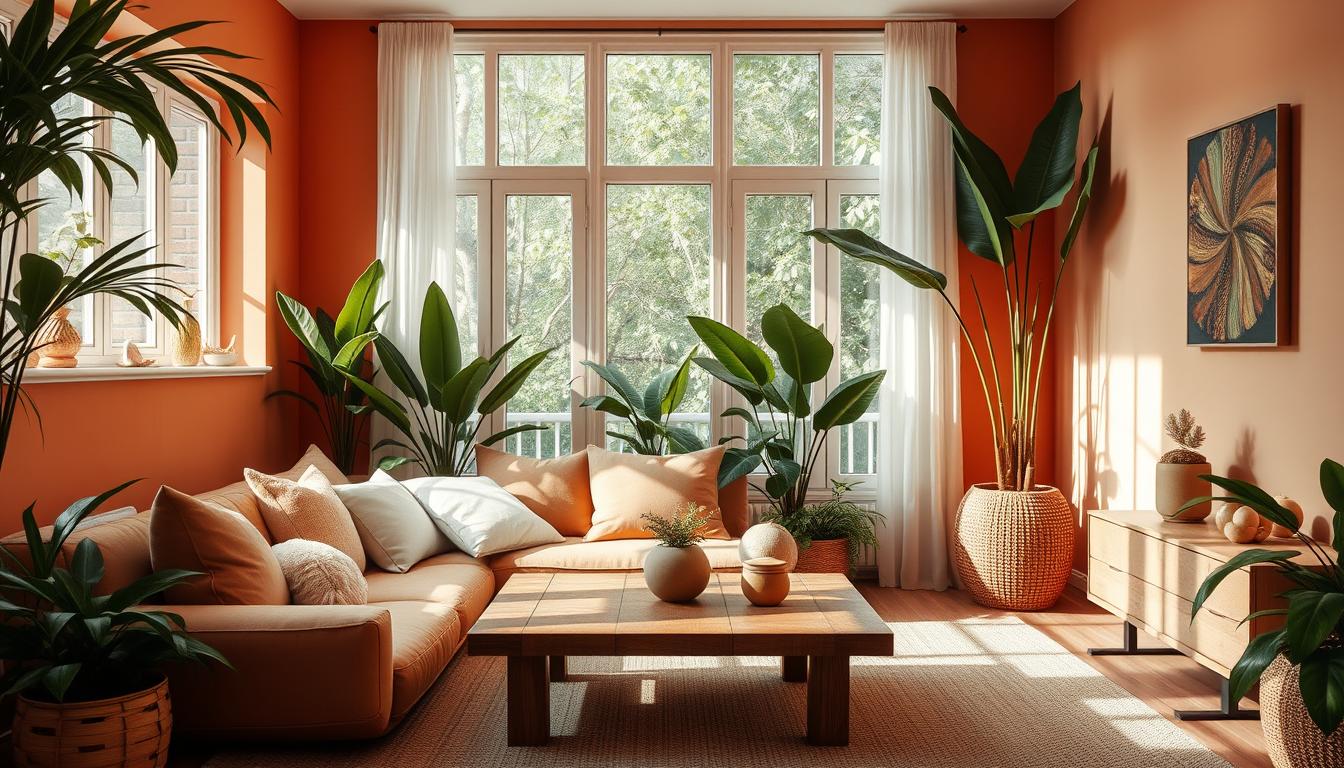
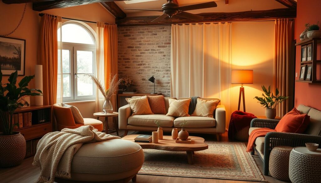
Choosing the right color schemes is key to a warm and inviting home. The colors around us deeply affect our mood and how we feel about a space. Whether you’re setting up a new home or updating your decor, picking the best colors is essential for that cozy feel.

In this guide, we’ll cover color theory basics and the psychology of warm colors. We’ll also show you the top color combinations that make any room feel like a cozy retreat. You’ll find inspiration for both traditional and modern color schemes to make your home warm and welcoming.
Key Takeaways
- Understand the basics of color theory and how it applies to home design
- Learn about the emotional and psychological impacts of warm color palettes
- Discover popular warm color combinations that create a cozy, inviting atmosphere
- Explore natural color schemes inspired by earthy tones and natural elements
- Discover tips for incorporating accent colors and balancing proportions in warm interiors
Understanding Color Theory Basics for Home Design
Learning the basics of color theory is key to making your home look great. It covers primary, secondary, and tertiary colors, and the differences between warm and cool colors. These principles help create color schemes that work well together.
Primary, Secondary, and Tertiary Colors
The primary colors are red, blue, and yellow. These colors are the base for all others. Mixing them creates secondary colors like orange, green, and purple. Tertiary colors come from mixing a primary and secondary color, offering more complex shades.
The Color Wheel in Interior Design
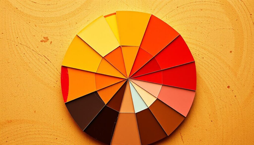
The color wheel is a vital tool for designers. It shows how colors relate to each other. Designers use it to pick colors that work well together, try out new combinations, and make spaces that feel right.
Warm vs. Cool Color Properties
Colors are either warm or cool. Warm colors, like red and orange, feel cozy and lively. Cool colors, such as blue and green, are calming. Knowing how to mix warm and cool colors is important for creating balanced designs.

“Color is a power which directly influences the soul.” – Wassily Kandinsky
Understanding color theory helps designers choose the right colors. This way, they can make spaces that are not just pretty but also feel right. It’s all about the color psychology and how colors make us feel.
Creating Harmony with Traditional Color Schemes
Traditional color schemes are great for making your home look good. They have been around for a long time. They help create a balanced and beautiful look. Let’s look at some traditional color schemes and how they can make your home look amazing.
Monochromatic Color Schemes
Monochromatic schemes use different shades of one color. This creates a calm and elegant feel. It’s perfect for small spaces because it makes them feel bigger.
Complementary Color Schemes
Complementary schemes pair colors that are opposite each other on the color wheel. Think blue and orange or red and green. These bold combos add energy but need to be used carefully to avoid being too much.
Analogous Color Schemes
Analogous schemes use colors next to each other on the color wheel. For example, blue, blue-green, and green. This creates a smooth and soothing look. It’s great for cozy rooms.
Triadic Color Schemes
Triadic schemes use three colors that are evenly spaced on the color wheel. Like red, yellow, and blue. This combo is lively but needs careful balance. Use one color as the main one, and the others as accents.
Understanding traditional color harmony helps create stunning interiors. Try out these classic color schemes to find the perfect fit for your home and style.

The Psychology Behind Warm Color Palettes
Creating a warm and inviting home is all about color psychology. Warm colors like red, orange, and yellow deeply affect our emotions and mood. Let’s dive into the world of color psychology and see how these colors impact us.
Emotional Responses to Warm Colors
Warm colors make us feel comfortable and energized. They bring a sense of happiness and passion. These colors also make our senses come alive, adding excitement to any space.
Impact on Mood and Behavior
The color meanings of warm tones can really change how we feel and act. They can make our heart beat faster and even make us hungry. In our homes, these colors can boost energy and creativity, perfect for places where we want to connect.
Cultural Significance of Warm Tones
Warm colors have a special place in many cultures. In Eastern cultures, red is seen as lucky and prosperous. In the West, it’s about warmth and welcome. Using these colors in our homes adds depth and meaning, connecting us all.
Understanding warm colors’ psychological effects helps us create homes that are not just beautiful but also emotionally and culturally rich. As we explore color psychology, let’s use these colors to make our homes warm and welcoming.
Popular Warm Color Combinations for Living Spaces
Warm color palettes can make your living space cozy and inviting. They add comfort and depth to any room. Let’s look at some popular warm color schemes to make your living area a cozy haven.
The classic earth tone palette is a timeless choice. It combines brown, beige, and terracotta to warm up any space. These color swatches look great with natural textures like wood, stone, and woven fabrics.
For a vibrant look, try rich jewel tones like burgundy, mustard yellow, and deep emerald. These bold color combinations bring glamour and sophistication while keeping things cozy.
Warm color palettes aren’t just about earthy tones. Mixing soft blush tones with muted greens and creamy neutrals creates a calm and serene atmosphere. It’s perfect for a living room or bedroom.
Choosing the right color scheme is key. Balance warm tones with complementary accents. Play with textures, patterns, and lighting to make your living spaces cozy and inviting.
Natural Color Palettes Inspired by Earth Tones
Looking for a warm and inviting home? Nature is the best source of inspiration. Earth-inspired color palettes bring us to peaceful landscapes. They make our homes feel calm and cozy, unlike artificial colors.
We’ll look at three natural color schemes to make any room cozier.
Desert-Inspired Color Schemes
Desert-inspired colors feel like stepping into a timeless oasis. Shades like sun-baked ochres and dusty terracottas show the beauty of dry lands. Add sage, turquoise, and metallic touches for a space that’s both grounded and exciting.
Forest and Mountain Palettes
Bring the outdoors in with forest and mountain colors. These palettes, with rich greens, deep browns, and blues, remind us of tall trees and snowy peaks. Add wood and stone textures to make these colors feel more natural.
Coastal Color Combinations
Want the calm of the sea indoors? Coastal colors bring the ocean’s peace with soft hues. Mix sand, driftwood, and sea glass for a calming feel. Add coral, sky blue, and cream to bring in the ocean’s rhythm.
Using nature’s colors in your home makes it beautiful and calming. Try these earthy palettes to turn your space into a cozy retreat.
Modern Trends in Warm Color Schemes
Warm color schemes are now a big deal in interior design. They range from deep, earthy tones to bright, sunny shades. These colors add a cozy feel to any room. Let’s look at the latest color trends, color combinations, and color palettes that are making warm colors popular.
Terracotta and adobe-inspired colors are back in style. They bring a natural, timeless feel to spaces. Designers mix these warm neutrals with bold, spicy colors like saffron and paprika. This adds excitement and depth to the room.
Warm, muted pastels are also trending. Soft pinks, peaches, and lavenders are being used with warm wood and textures like linen. This mix creates a calm, welcoming vibe that’s both modern and cozy.
Warm metallics like brass, copper, and gold are also big. They add a luxurious touch to spaces. These metals blend well with the earthy tones that are common in today’s designs.
| Warm Color Trend | Key Characteristics | Complementary Accents |
|---|---|---|
| Terracotta and Adobe | Natural, rustic, grounded | Vibrant spice tones, warm wood |
| Muted Warm Pastels | Soothing, inviting, contemporary | Textured materials, warm wood |
| Warm Metallics | Luxurious, elegant, refined | Rich, earthy tones, natural materials |
As we keep exploring warm colors, we’ll see more creative uses in homes. Whether it’s bold colors or subtle touches, warm colors are a big hit in design.
Incorporating Accent Colors in Warm Interiors
Designing a warm and inviting home is easier with accent colors. They add depth, contrast, and interest. By picking the right colors and balancing them, you can make your space pop.
Selecting Complementary Colors
Choosing the right accent colors is key. Look for hues that match your color swatches and create a nice contrast. Try colors like blues and oranges or greens and reds. This will make your space look great and balanced.
Balance and Proportion Tips
- Start with small amounts of accent colors, like throw pillows or artwork. This keeps the space from feeling too busy.
- Follow the 60-30-10 rule. This means 60% of the room is the main color, 30% is secondary, and 10% is accent.
- Think about the room’s size when adding accent colors. Smaller rooms need softer colors, while bigger ones can handle bolder ones.
With careful choice of accent colors, your warm interior will shine. It will become a beautiful, inviting space that makes you want to stay longer.
Room-Specific Color Schemes for Maximum Comfort
Choosing the right color scheme for your home is not simple. Each room has its own purpose and mood it should have. By knowing how colors affect us, you can make your home feel truly yours.
In the living room, warm color schemes like terracotta, mustard, and sage make it cozy. They encourage people to talk and spend time together. Bedrooms do better with soft colors like blues, lavenders, and greens. These colors help you sleep better and feel calm.
Kitchens look great with bright color schemes like red, orange, or yellow. They make you hungry and full of energy. Bathrooms are best with calming colors like blues and greens. They make you feel relaxed and refreshed.
| Room | Recommended Color Schemes | Desired Ambiance |
|---|---|---|
| Living Room | Earthy tones (terracotta, mustard, sage) | Cozy, relaxed |
| Bedroom | Soft blues, lavenders, muted greens | Tranquil, soothing |
| Kitchen | Vibrant reds, oranges, yellows | Stimulating, energetic |
| Bathroom | Calming blues, greens | Serene, rejuvenating |
Matching color schemes with each room’s needs makes your home comfortable. It supports your physical and emotional health.
Lighting’s Impact on Warm Color Palettes
Lighting plays a huge role in making a home warm and welcoming. It’s key to know about color theory and psychology to get the right feel. Whether it’s natural or artificial light, understanding these concepts is crucial.
Natural vs. Artificial Light
Colors look different under natural and artificial light. Natural daylight shows off warm colors’ depth and richness. Artificial light, like incandescent or LED bulbs, changes how we see these colors, creating a unique mood.
Color Temperature Considerations
Choosing the right lighting is important for warm color palettes. Warm light, like soft white or amber, makes colors cozy and inviting. Cool light, like bright white or blue, can make warm colors seem less vibrant and muted.
By balancing lighting and color psychology, you can create a beautiful atmosphere. This atmosphere truly shows off your home’s warmth and character.
Seasonal Adaptations of Warm Color Schemes
Warm colors bring coziness all year round. But, smart homeowners adjust their color trends and color combinations with the seasons. This way, they keep their homes inviting and in tune with the seasons.
Autumn brings out earthy color schemes. Think of rustic oranges, deep reds, and golds. These colors remind us of cozy fires and harvests. Winter brings jewel tones like plum, emerald, and sapphire. Add cozy textures and metallics for a touch of luxury.
Spring brings light and bright color combinations. Soft pastels and cheerful brights like lemon, mint, and coral refresh any room. Summer is all about light, sunny color trends. Think of citrus, aquas, and sun-kissed neutrals.
“Seasonal color adaptations allow you to seamlessly transition your home’s atmosphere, creating a sense of harmony and comfort throughout the year.”
Changing your color palettes with the seasons makes your home warm and welcoming. Whether it’s autumn’s rich colors or summer’s bright tones, seasonal color combinations can change your space and improve your design.
Combining Textures with Warm Color Palettes
Designing a cozy home involves warm colors and textures. Choosing fabrics and materials that match your color harmony can make your space more interesting. This adds depth and beauty to your home.
Fabric and Material Selection
Using different textures is crucial for a striking warm color scheme. Choose luxurious fabrics like velvety, chunky knits, and soft weaves. These add warmth and depth to your rooms.
Pair these with natural materials like wood, rattan, and stone. This creates a perfect balance of color swatches and textures.
Creating Visual Interest
Layering textures can make solid colors more interesting. It adds depth and visual appeal to your color trends. Mix smooth and rough textures, shiny and matte finishes.
Even adding faux fur or velvet can make your space cozy and captivating.
| Texture | Warm Color Palette | Visual Impact |
|---|---|---|
| Velvet | Rich, jewel-toned hues | Luxurious and sophisticated |
| Chunky Knits | Earthy, neutral tones | Cozy and inviting |
| Woven Rattan | Terracotta, ochre, and sandy shades | Natural and organic |
By mixing warm color harmony with various textures, you make your space welcoming and comfortable. It’s not just beautiful but also cozy.
Color Schemes for Small vs. Large Spaces
The size of a space greatly affects the best color scheme. Warm colors have a special role in creating the right mood. This is true for both small and large areas.
In small rooms, warm colors make the space feel bigger. Rich, saturated tones make walls seem farther away. Colors like burnt sienna, mustard yellow, and terracotta add coziness and make the room feel larger.
In bigger rooms, warm colors bring a cozy feel. They naturally draw the eye inward, making large spaces feel welcoming. Think about using deep reds, warm browns, or vibrant oranges to make the room feel more inviting.
It’s key to balance warm and cool tones in any room. Adding a contrast, like metallic accents or a cooler color, prevents the space from feeling too much or too little.
| Small Spaces | Large Spaces |
|---|---|
|
|
Understanding color psychology and color theory helps you choose the right warm colors. This is true for both small and large spaces.
Common Mistakes to Avoid in Color Selection
Creating a warm and inviting home starts with color theory. One big mistake is using too many bold or intense colors. This can make a space feel cramped and overwhelming. Instead, aim for a color palette that’s soft and muted, with touches of bolder colors.
Another mistake is not thinking about how lighting affects color. The same color looks different in natural versus artificial light. It’s important to check how your colors will look in each room’s lighting. Ignoring this can lead to colors that don’t look as good as you hoped.
Lastly, not having a cohesive design is a common error. Make sure your color scheme works well with all parts of your space. This includes furniture, decor, walls, and floors. A well-coordinated space feels warm, inviting, and intentional.


